
The news reports this week that Sen. Reynold Nesiba is considering legislation to create a commission to recommend a new South Dakota state flag. The idea follows recent efforts in Utah and Minnesota to adopt new state flags.
As a state legislator, I’m not taking a position on this idea right now, but as a South Dakota history blogger, I would share a few thoughts.
Several years ago, this blog posted an overview of South Dakota’s state emblems: everything from the bird and the flower to the musical instrument and the dessert. Prominent among our state emblems is the state flag, which includes an image of the state seal.
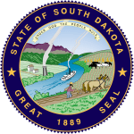
The South Dakota state seal is described in Article XXI, section 1 of the Constitution of South Dakota, and was adopted along with the Constitution in 1889. The Constitution also sets the state motto as “Under God the People Rule” and requires that it appear on the state seal.
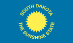
The first state flag was adopted in 1909. Unusually, it had two different sides. One side had a golden sun in a blue fieldwith the words “South Dakota The Sunshine State” on one side. On the reverse side was the state seal. (Pictured is a rendering of how the front of that flag appeared.)
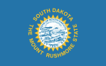
A flag with two different sides was expensive to produce, so in 1963, the two sides were combined, with the state seal being placed within the golden sun. It was modified in 1992, when South Dakota changed its nickname from”The Sunshine State” to “The Mount Rushmore State.” This is the flag design that is familiar to South Dakotans today.
Many South Dakotans like the state flag, but it is not a favorite of flag design experts or “vexillologists,” who generally deride the many state flags that are some version of “state seal on a blue background.” (An example is here.) South Dakota stands out from some of the others, though, thanks to the lighter blue color and the golden sun.
The South Dakota state flag also fares poorly when evaluated against the North American Vexillogical Association’s “Five Principles of Flag Design”:
- Keep It Simple. The flag should be so simple that a child can draw it from memory.
- Use Meaningful Symbolism. The flag’s images, colors, or patterns should relate to what it symbolizes.
- Use 2 or 3 Basic Colors. Limit the number of colors on the flag to three which contrast well and come from the standard color set.
- No Lettering or Seals. Never use writing of any kind or an organization’s seal.
- Be Distinctive or Be Related. Avoid duplicating other flags, but use similarities to show connections.
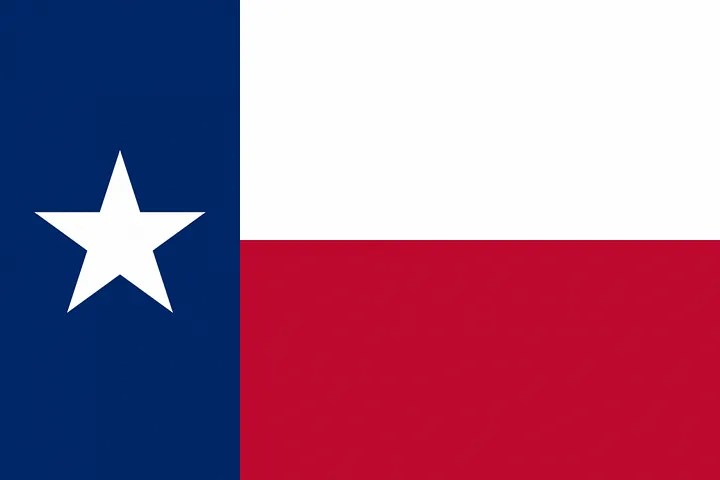
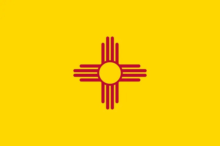
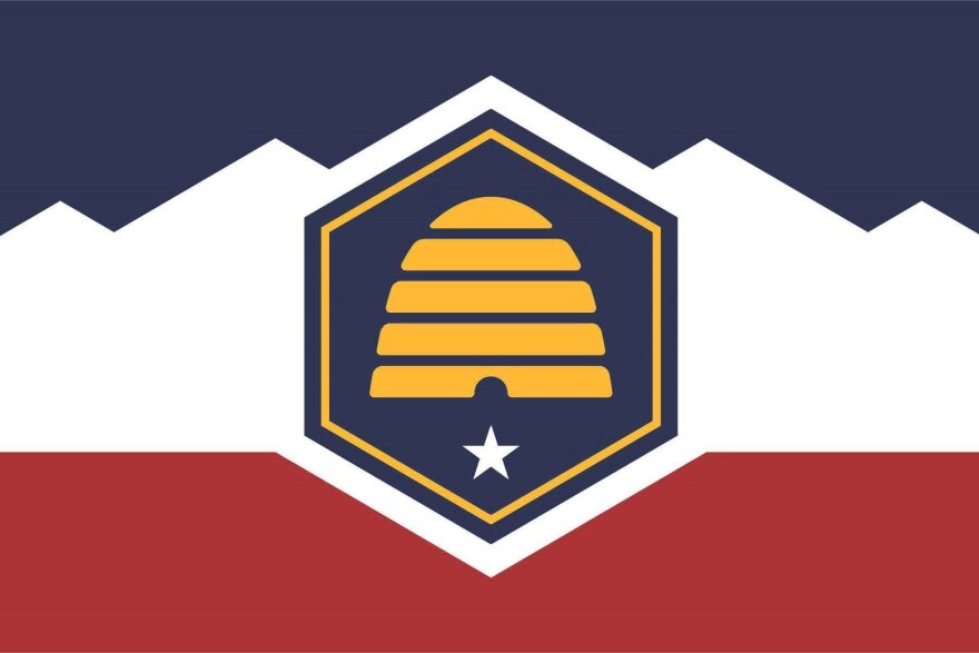
These principles favor bold and distinctive flags, such as the state flags of Texas, with its Lone Star, or New Mexico, with the Zia sun symbol. New flags in Utah and Minnesota attempt to meet this criteria, with Utah adopting the beehive symbolism and Minnesota using the North Star.

Rep. Bernie Hunhoff was the last legislator to broach the topic of a new state flag, when he proposed in 2012 that the current flag be replaced with a design by Spearfish artist Dick Termes. That flag retained some elements of the current flag, including the light blue field and the golden sun, and added Native American design elements.

A more successful flag design effort was undertaken in Sioux Falls with the city flag that was proposed in 2014 and adopted in 2018. The design included a white and blue zig-zagging line, meant to evoke the Falls of the Big Sioux as well as the city’s growth trajectory. The reddish color represents the Sioux quartzite that is common in the city’s architecture.
Interestingly, the Sioux Falls flag evokes the South Dakota flag in a way that suggests what would be the most obvious way to simplify the state flag’s design. The Sioux Falls flag uses the light blue color and the golden sun, but without the state seal or any other writing. This would return the flag to a design more similar to the front of the original state flag.
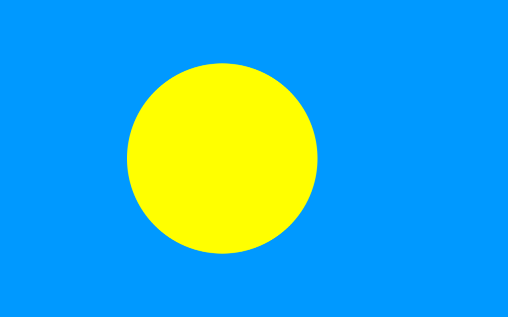
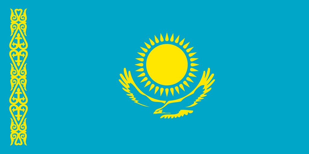
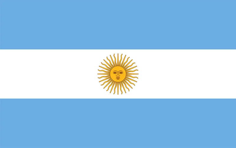
Unsurprisingly, though, the idea of a golden sun in a blue sky is not unique among flags. The national flags of Palau, Kazakhstan, and Argentina all use a somewhat similar design:
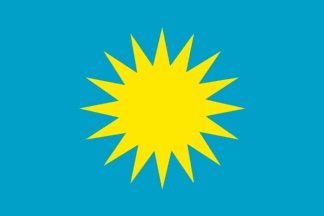
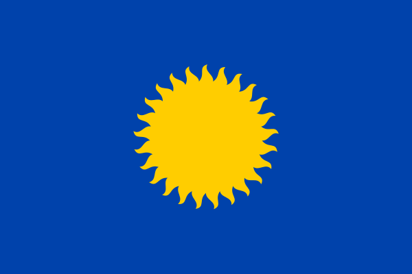
More on-the-nose are the flags of two European cities, Lançon-Provence in France and Těrlicko in the Czech Republic:
Of course, a new South Dakota state flag commission could go in a completely different direction, as the Minnesota and Utah flag commissions did.
